 |
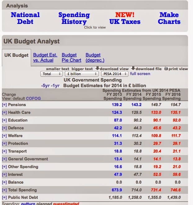
| This site gives some detailed figures |
You can see how often cost, and the economy, is raised in the parties' political broadcasts on TV, some of which are gathered here.
This often comes up during 'PMQs' (Prime Minister's Questions', a weekly event in the House of Commons when the PM has to answer a series of questions from other MPs. Here's an iPlayer link to an example.
The links below will help YOU to answer these questions for YOUR policies!
2014 UK GOVERNMENT SPENDING FIGURES:
Guardian (UK daily 'broadsheet' or 'quality' newspaper) pie chart of 2014 government budget here.
BBC summary of 2014 budget changes.
You can also get a pie chart at the ukpublicspending website, or click on areas of government spending for some more detail on where the money goes.
There are many more resources, often more challenging, in this post.
(2013:
Presented as a pie chart here.
In greater detail here.)
YOU should be prepared and equipped to answer questions such as this, or others - perhaps from some who don't sure your views!
 |
| You can also find data (and opinions) on specific areas of government spending by googling terms like this one, or 'uk defence spending' |
2014 UK GOVERNMENT SPENDING FIGURES:
Guardian (UK daily 'broadsheet' or 'quality' newspaper) pie chart of 2014 government budget here.
BBC summary of 2014 budget changes.
You can also get a pie chart at the ukpublicspending website, or click on areas of government spending for some more detail on where the money goes.
There are many more resources, often more challenging, in this post.
(2013:
Presented as a pie chart here.
In greater detail here.)
 |
| Guardian pie chart: click HERE for full-size view |
 |
| Not as detailed, but click HERE to see this version. |